
Viseart Petites Mattes Editorial Brights
Voila! Petites Mattes Collection has arrived! This charming “miniature” palettes are a celebrated carbon copy of our iconic large 2 gram pro palettes. The chic and slim-lined packaging is fully wipeable, slips easily into a kit bag and allows for you to create your own bespoke color palette for each job or work of artistry allowing for full customization and hygiene to reflect the modern demands of a pro makeup artist.
The Petites Mattes Collection is our carefully curated solution to the challenges of our ever-changing beauty landscape for Pro artists and makeup mavens. Available in 6 incredible color stories - Neutral, Warm, Cool, Dark, Milieu and Editorial Brights - each ‘Petites Mattes’ palette houses 12 pans of universally flattering pigment-rich, essential matte shadows for defining and sculpting in mix and match magnetized pans for: eyes, brows, lips and cheekbones.
The same stellar quality, the same exquisite payoff, the same saturation, and the same sublime colors - now in a “Petite” and playful presentation with a price point that will make you swoon! Whether you are beginning your makeup journey, or you are a seasoned pro who wants a bespoke kit that you can create exclusively for jobs and individually for clients, or if you are curious to develop your collection with hues which excite and challenge- then check out our Petites Mattes Collection! The magnetized 1g pans of Petites Mattes are housed in recyclable cardboard packaging and offer mix and match magnetization throughout the Petites Mattes, Petit Pro & Edit collections. Curate your own Viseart dream palette!
Come play in a world of endless color! The Viseart Editorial Brights Pro palette is found in the kit of every pro-artist and is now available in a succinct, sustainable, and affordable travel-size palette! These bold and bright hues are a playground for the imagination and the original, our much-coveted Editorial Brights Pro palette has been used on faces, bodies, and canvases the world over. The phenomenal formula of Viseart Paris mattes allows the shadows to be used as a mix in amplifying our other matte hues, it can be sheared out into a wash, pastelised by using the white shade in combination with any of the other shades to create a pastel hue, or liquefied for a bold, graphic look! Each shade works wonderfully in conjunction with our other products for a punch of pigmented color. If you live life in full colour, or are eager to learn and explore, then Petites Mattes Editorial Brights is a must-have in your kit! Mix and match each magnetized pan throughout the Petites Mattes, Petit Pro & Edit collection, and curate your own personal dream palette!
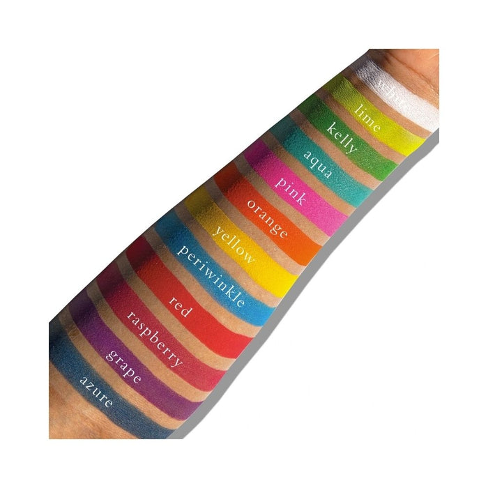
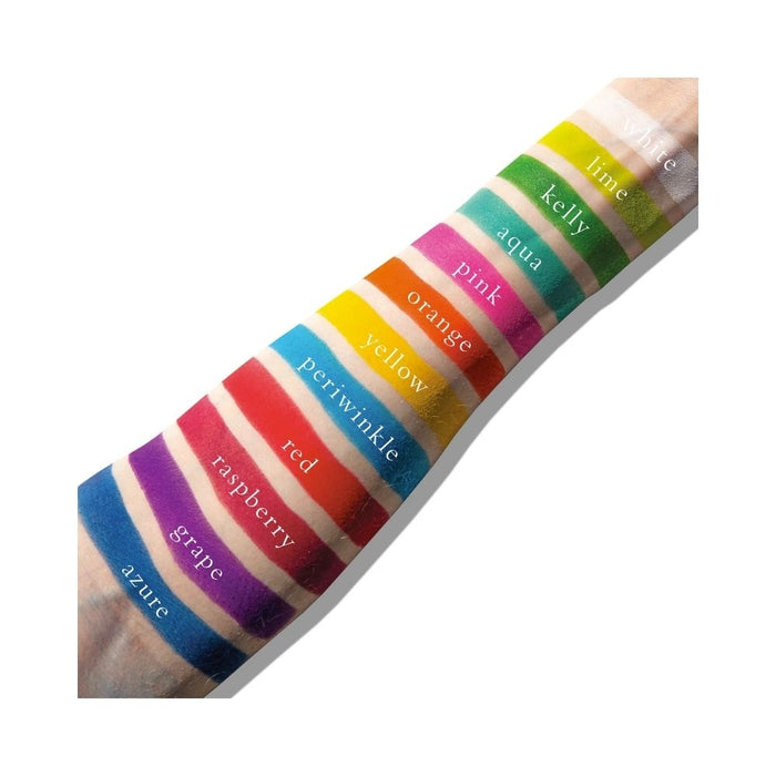
Shade Descriptors:
Shade 1: White — Bright white with a matte finish.
Use: The most versatile! This can be mixed with any of the other colors to make pastels, or blended in as a matte opaque color.
Shade 2: Lime — Neon yellow green with a matte finish.
Use: This is a tertiary color, as it’s a yellow-green, Mix with white to make pale lime, or with Clover to intensify the depth of the green. This color is also analogous to both blues and yellows.
Shade 3: Kelly — Bright green with a matte finish.
Use: This is a secondary color, mix with white to make pale green, with yellow to make a lighter green, or with blue to make Teal.
Shade 4: Aqua — Bright aqua with a matte finish.
Use: This is a tertiary color, it’s a blue-green. Mix with white to make anything from pastel teal to turquoise.
Shade 5: Pink — Bright fuchsia pink with a matte finish.
Use: A tertiary color, mix with white to make anything from pastel to bubble gum pink, or use to brighten up blue and green eyes. This can also be used on cheeks, or mix with a blush that’s too light to intensify it.
Shade 6: Orange — Primary orange with a matte finish.
Use: A secondary color, mix with white to make anything from a pale orange to pastel. Orange is amazing against blue eyes, or use analogous colors with it, like Red and Yellow.
Shade 7: Yellow — Primary yellow with a matte finish.
Use: Yellow is a primary color, which makes it ultra versatile. Mix with white to make anything from pastel to buttercup! You can also blend with orange to intensify the yellow, or blend with red to change the depth of the orange.
Shade 8: Periwinkle — Cyan blue with a matte finish.
Use: A tertiary color, Mix with white to range from pastel to sky blue, or use with analogous colors like purples or greens.
Shade 9: Red — Neon red with a matte finish.
Use: A primary color, Mix with white to make multiple shades of pink, or blend out to create purples, browns, oranges and more.
Shade 10: Raspberry — Bright raspberry with a matte finish.
Use: This is a tertiary color, it is a red-violet. It’s fantastic against brown or hazel eyes to brighten, but is a super versatile color with almost every eye shade.
Shade 11: Grape — Bright magenta purple with a matte finish.
Use: This secondary color can be made into pastel simply by mixing with white. This is also super versatile for every eye color to intensify.
Shade 12: Azure — Cerulean blue with a matte finish.
Use: This is a primary Blue, Mix with white to make a pastel blue, or use dramatically for anything you can think of. This can be used for liner, lid, crease - the sky's the limit. Blue is also a wonderful color to brighten Brown and Hazel eyes.